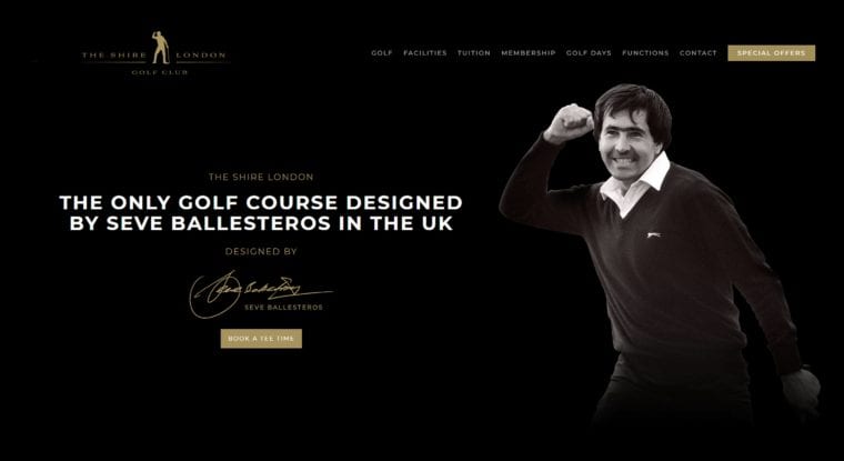
Have you seen the new Shire London website? The ShireLondon’s new-look online tee-time booking service, powered by GolfNow and price-managed on a weekly basis by The Revenue Club.
The club director Ceri Menai-Davis said: “Our new brand identity reflects the high-end look of many of the USA’s top golf resorts.”
“With new golf facilities on the horizon at the West London Links in Northolt and at The Dye London in Edgware, we wanted to create an identity which would work in harmony with these as we provide ever-more exciting facilities for golfers around London in the coming decade.”

Let’s see what are the pros and cons of the new web design.
Review: The Shire London new website
Pros:
- Usage of lifestyle photography that is less staged, more emotional and shows what kind of experience, guests can get and find at the Shire London. It is a good way to show the human dimension of a product or a service.
- It is also good that on the main page (see picture above), our attention is directed to one of the main goals of the website: tee time booking. What is not so good for The Shire London and the golfers that after clicking on the ‘book tee time’ click-to-action button you are directed to a page where you have to find the next step of the process. Actually, you have to scroll down relatively lot, then select your guest type (member vs. visitor). I predict this will be one of the pain points where The Shire London will lose prospects. People are looking for a simple, logic, and quick services.
- I enjoyed my visit to their website via my mobile. It was easy to read and use.
- Social media channels’ links are displayed on the main page.
Cons:
- In 2018, it is really important to have an interactive and responsive website. The more advanced companies today are offering live chat and chatbot services. I would not neglect to offer WhatsApp or Viber communication opportunities as well. This should be fixed as soon as possible.
- When I first visited the website, I had a feeling that something is wrong since the logo on the top left corner was not in line with the menu bar. After changing from 100% to 75% the page size everything looked OK.
- I would consider using a floating navigation menu to help visitor discover the website more easily and not to get lost…
- As the online communication is getting more and more video-driven, it is more effective to use video to show prospects what kind of experience they can get in the golf club.
- I know we are in a content tsunami where it is hard to get noticed. However, even golf clubs cannot afford to neglect the importance of SEO.
- Where are the social proofs?? In a world where customers do not really trust brands and companies, we must come up with social proofs to gain trust and improve our reputation.
- Why there is no newsletter in this golf club? Why don’t they develop a consumer database for newsletter communication? I believe that email marketing can be a very profitable communication channel with a high ROI. 72% of consumers in Litmus’ 2016 State of Email report stating that email is their first choice for brand communication, and more than 225 billion emails (PDF) sent every day (a 5% increase from previous years), email continues to play an important role in brands’ marketing strategies and is the digital linchpin for the consumer.
- Why don’t they enable their website visitors to share the content by providing a social sharing application to the website? It is good for building awareness, trust, but also for SEO. We have to make the information to move!
One final thought, if they could manage more effectively their social media channels (Facebook, YouTube, Twitter, Instagram) they could generate significant website traffic for themselves in addition to a better relationship with their members, visitors, and prospects.
These are my first thought after checking The Shire London’s new website.
