Golfers and golf club guests are expecting an interactive user experience in 2023. Interactive content is twice as likely to engage a visitor as static content.
Those websites that continue to communicate in broadcasting style (aka one-way communication) in 2023 are doomed.
Interactive and visual storytelling is on the rise. Thanks to technological advancement, we can present golf and other experiences available in our golf clubs much more effectively.

Of course, this also requires that we have sufficient knowledge of the latest web design trends and technologies. It also requires continuous content creation.
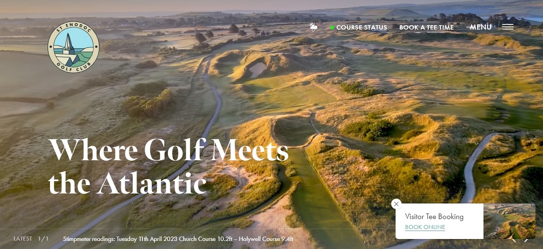
I’m not revealing anything new when I say that our brain absorbs image and video materials much faster than textual content. This is why worth using drone photography – see St Enodoc Golf Club‘s new website – or live videos or recorded videos.
By itself, of course, the video is not worth much, if it does not include storytelling to create a compelling narrative for your video content. The script should be short and sweet.
The usage of parallax effects could provide an even greater online experience to visitors to the St Enodoc Golf Club website. This visual technique creates an illusion of depth which leads to a faux-3D effect on the scroll. However, I must tell you excessive movement within parallax effects should be avoided.
If you are lucky enough that golfers have found your website, then give them an immersive experience. Ask your digital marketing agency how you can offer dynamic/personalized content to your website visitors!
This is why I recommended to my client – Zala Springs Golf Resort – to utilize Pathmonk, an AI-based content recommendation solution. Thanks to it, conversions grew by 90%.

I really missed from the new St Enodoc Golf Club website the information about the experiences available in the golf club and in the area near the club. Such information can motivate many golfers to consider your golf club.
If we are talking about content personalization, we should be utilizing chatbots in a strategic way.
Because, as we can see on the website of the St Enodoc Golf Club, the golf club’s marketer did not think that this could be the starting point of a relationship and a dialogue at the same time.
In its current form, it misses out on a lot of possibilities, as it only deals with tee time booking. Not to mention that they could have done it more elegantly.
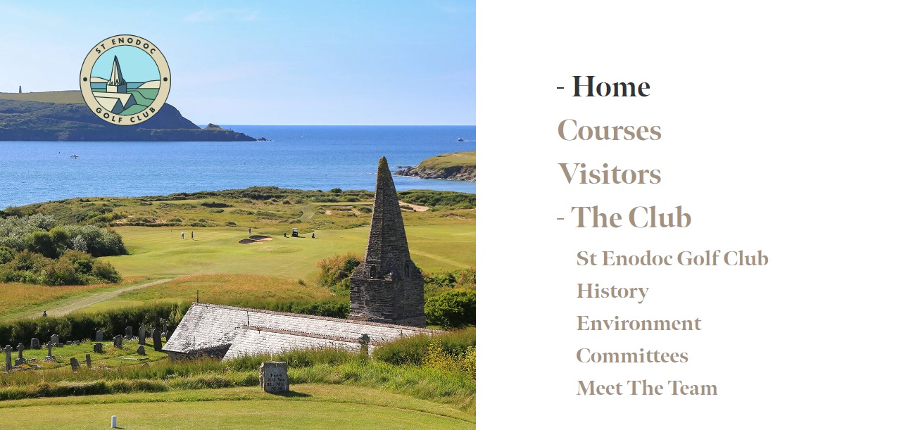
For example, the menu bar at the top of the website could be fixed to the top of the visitor’s screen so that when the person is scrolling down will see the “Book a tee time” menu link.
The new website speed is 1.24 sec. This is really good. To improve the new St Enodoc Golf Club website’s downloading speed I recommend these changes:
- Use Expires headers to website components to become cacheable, which avoids unnecessary HTTP requests on subsequent page views.
- Compression reduces response times by reducing the size of the HTTP response. Gzip is the most popular and effective compression method currently available and generally reduces the response size by about 70%. Approximately 90% of today’s Internet traffic travels through browsers that claim to support gzip.
- Decreasing the number of components on a page reduces the number of HTTP requests required to render the page, resulting in faster page loads. Some ways to reduce the number of components include: combine files, combine multiple scripts into one script, combine multiple CSS files into one style sheet, and use CSS Sprites and image maps.
Now, these are the first things that came to mind about the new St Enodoc Golf Club website. What would you improve on it? What is your favorite golf club website and why? Share it in the comments!
